Molson Coors
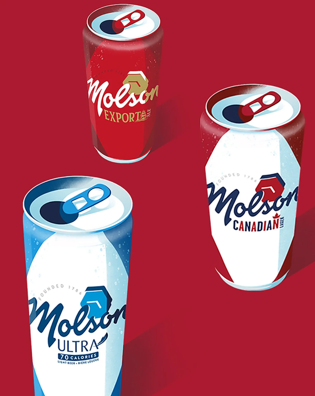
A rebranding campaign for Molson, with visuals by Domagoj Sokcevic.
- ClientMolson Coors
- BrandMolson, founded in Montreal in 1786 and one of the oldest breweries in North America
- WorkIllustrated campaign visuals for the rebrand
- IllustratorDomagoj Sokcevic ↗
- Creative directionAndrej Kiszling, Owl Illustration Agency
The rebrand brought the Molson family under one mark, a red hexagon above the classic Molson script. The illustrations had to carry that idea across very different beers: the gold of Export Ale, the red and white of Canadian Lager, the cool blue of the 70-calorie Ultra.
Domagoj answered with a single, confident graphic language. Each can is seen from above with the tab just opened, drawn with flat shapes, crisp highlights and a fine grain, so the whole range reads as one family while every beer keeps its own colour.